JTV Rewards
Overview
JTV Rewards is a money-back spending initiative launched by JTV.com, aimed at enhancing the overall shopping experience for its customers. This program allows shoppers to earn 1% Brilliant Cash for every dollar spent on the JTV.com platform.
Enhanced User Engagement
Improve customer engagement by creating an intuitive and user-friendly interface for the JTV Rewards program, encouraging users to explore and participate actively.
Simplified Navigation
Streamline the user journey within the JTV.com platform to effortlessly access and utilize the JTV Rewards features, maximizing customer participation.
Brand Alignment
Align the visual and interactive elements of the JTV Rewards program with the overall brand aesthetic of JTV.com, ensuring a cohesive and branded experience.
My Role
I was the sole UX/UI designer on an agile team of stakeholders, project managers, subject matter experts, developers, and quality assurance testers. I was responsible for determining the overall design direction of the project, while collaborating with the rest of the team on ideation.
Deliverables
Interaction Design
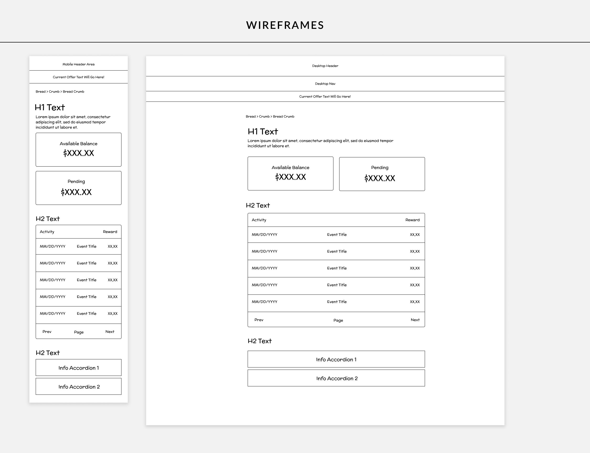
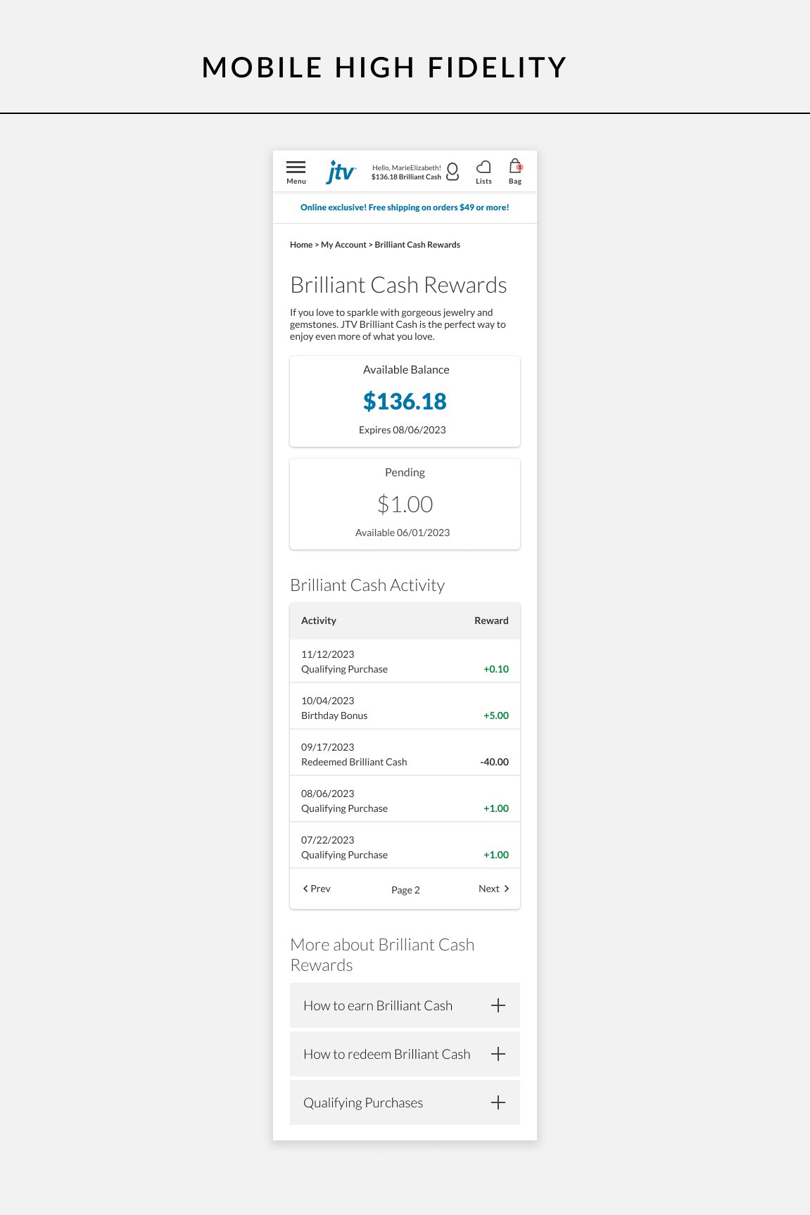
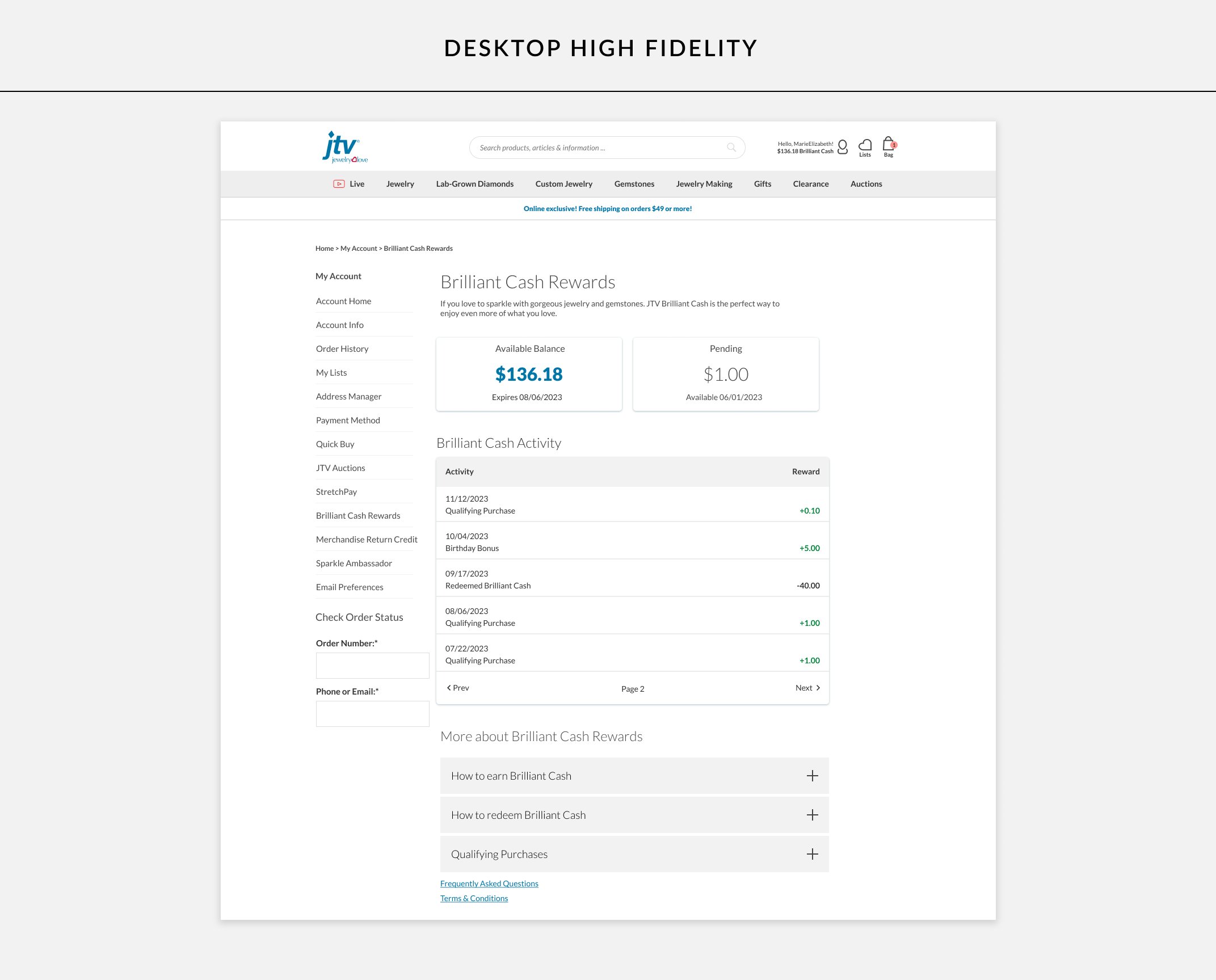
High-Fidelity Prototypes for desktop and mobile screens.
Workflow Mapping
User Interviews
Competitor Analysis
Custom Component Creation
Project Specifications
Duration: 6 weeks
Tools:
Figma
Illustrator
Jira
Competitive Analysis
Conducting a competitor analysis of rewards programs was a crucial step in understanding the landscape and gaining insights to enhance the effectiveness of the JTV Rewards initiative. A few of the key benefits of our competitive analysis were:
Informed Decision-Making
Used insights from the analysis to make informed decisions on program structure and strategy.
Adaptability
Stayed adaptable by understanding emerging trends and innovations in loyalty programs within the industry.
ROI Optimization
Optimized return on investment by aligning our rewards program with successful industry practices and avoiding pitfalls.
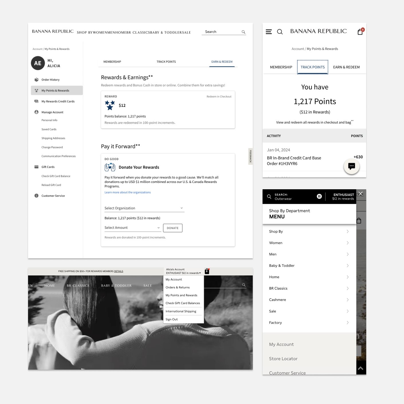
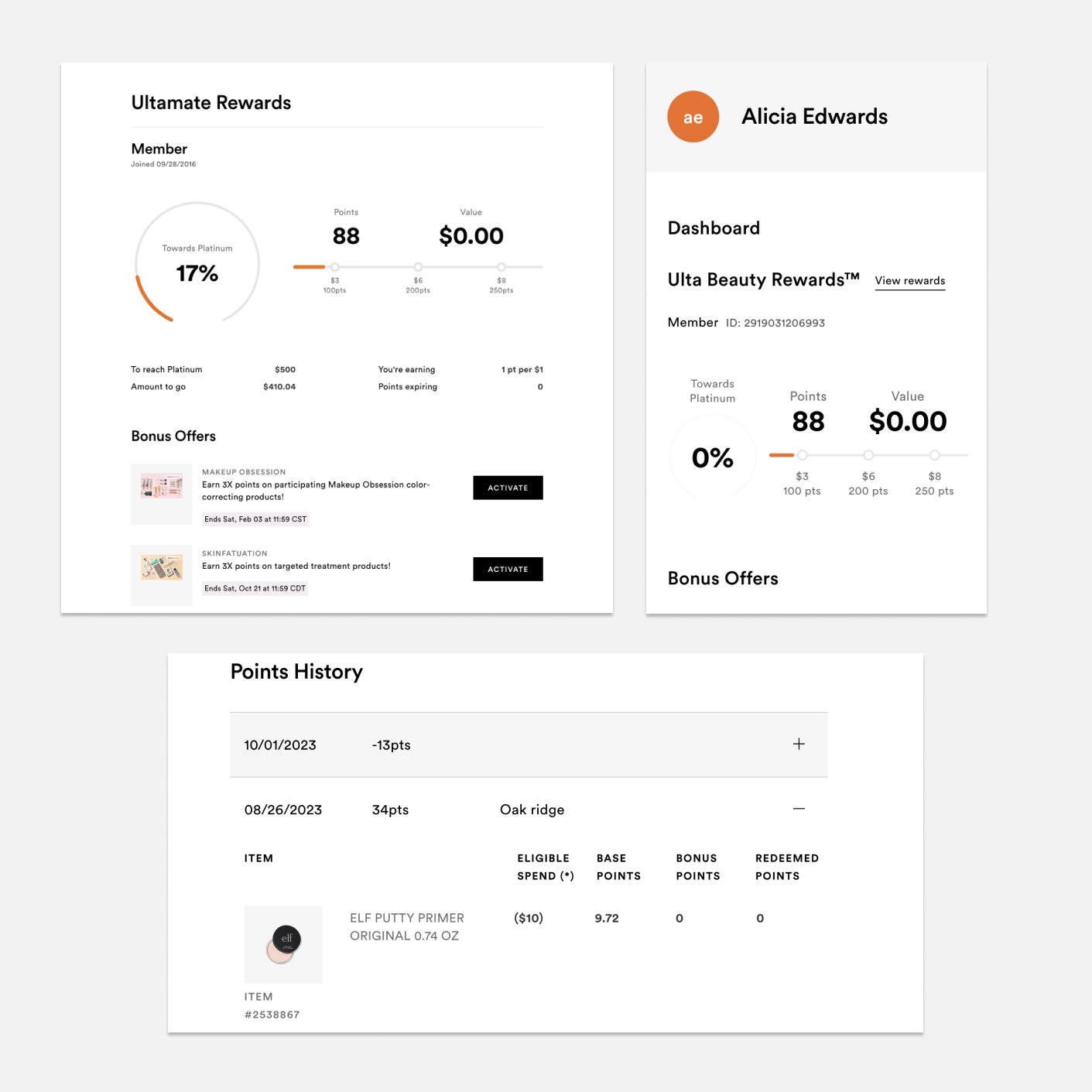
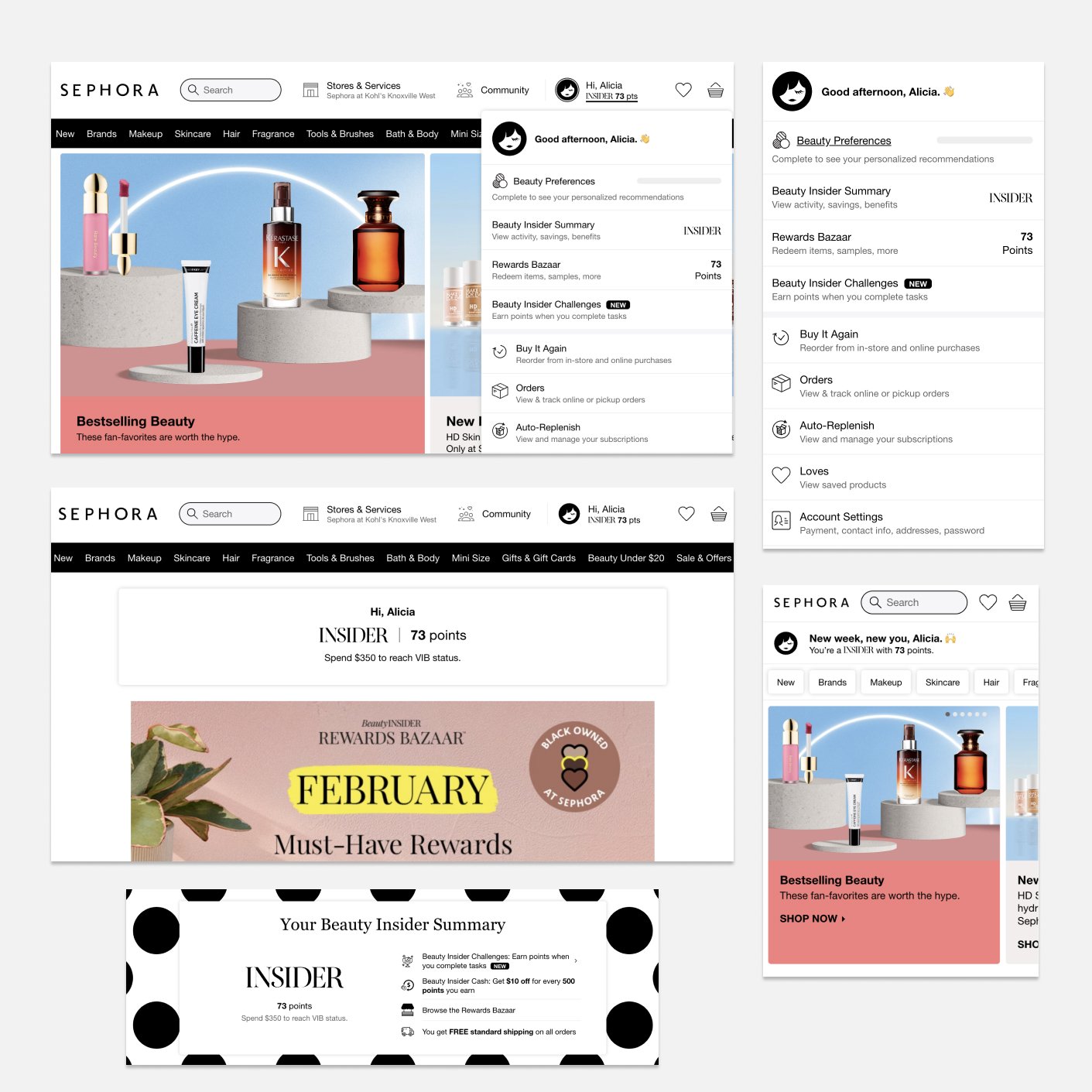
Adding Brilliant Cash into Site Header
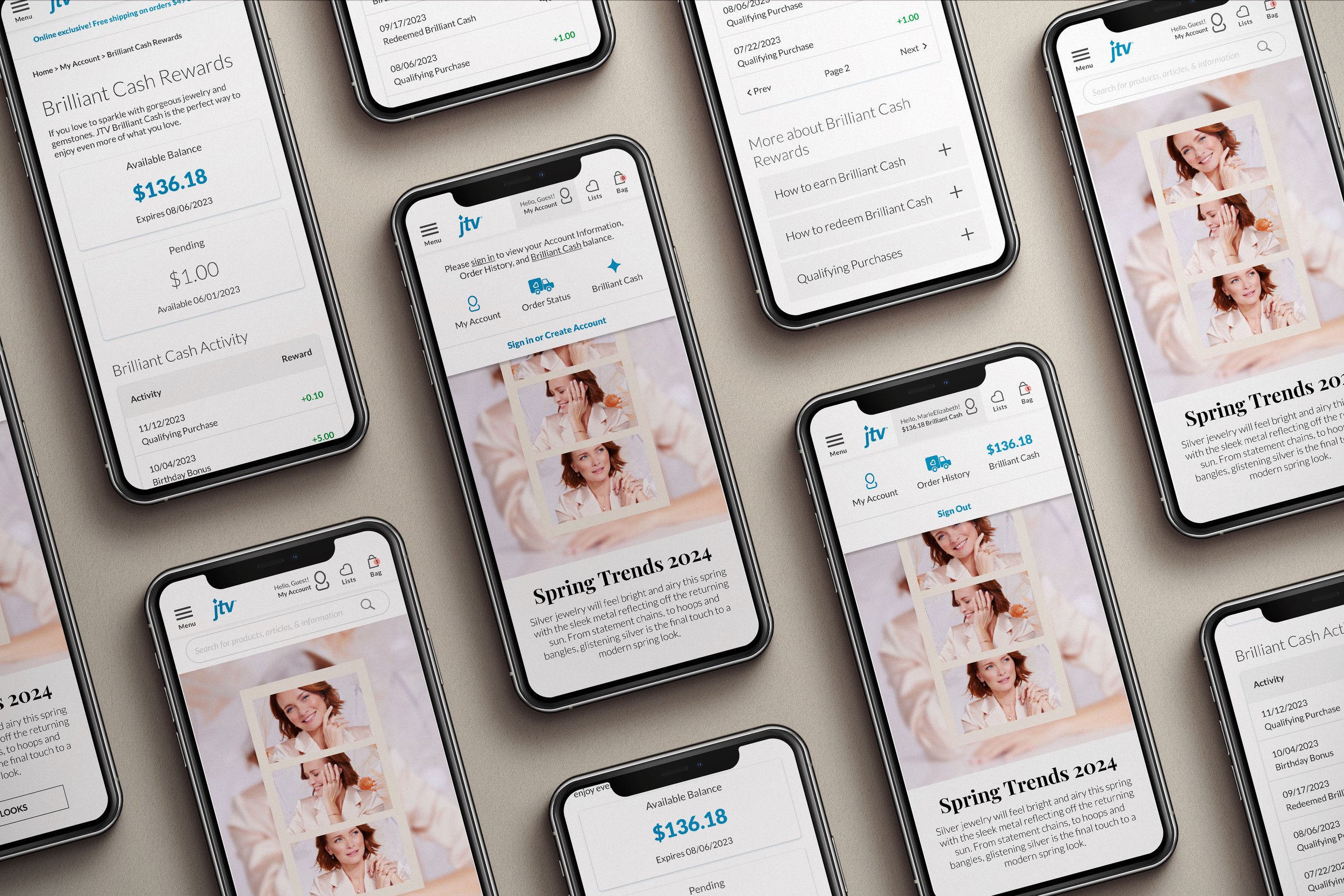
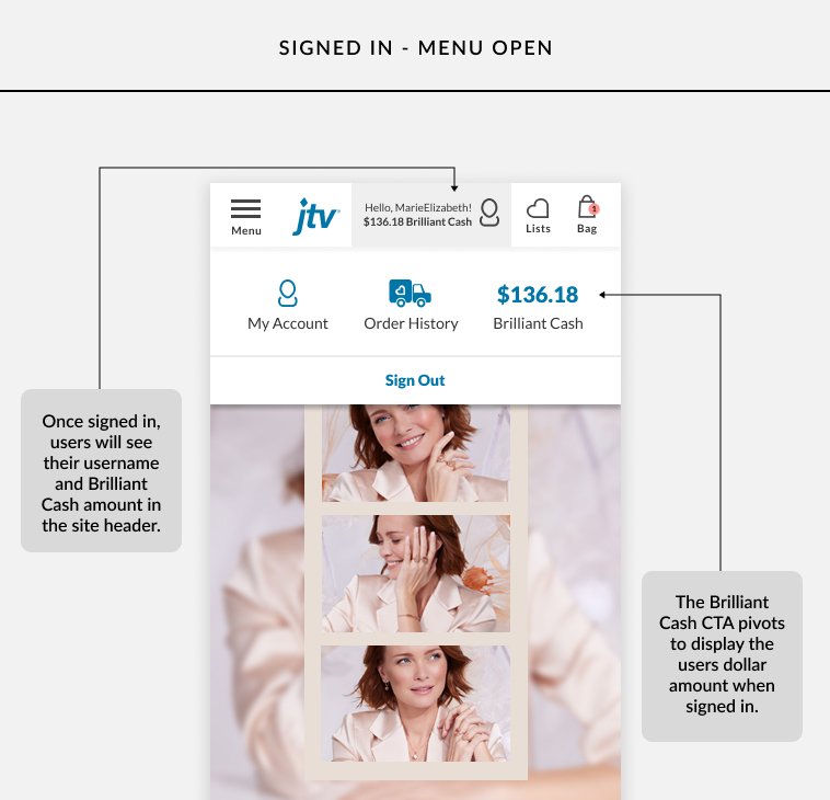
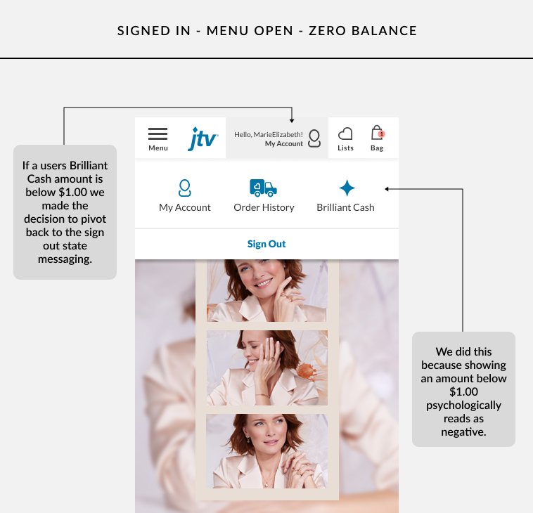
After conducting thorough research and competitor analysis, we discovered that the most instinctive and seamlessly integrated location for a user's Brilliant Cash balance is within the main header of the site.
Problem
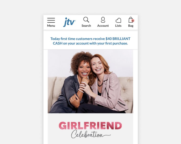
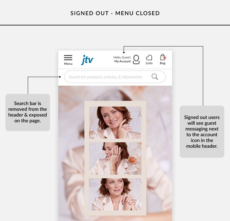
How do we introduce Brilliant Cash into the site header in a way that avoids overwhelming users with information. This is a particularly tough problem on mobile, where the header is already crowded.
Solution
Remove the search feature from the Mobile header and expose it permanently on the page. This will free up space to add Brilliant Cash into the header while also improving the usability of the search function in general.
Problem
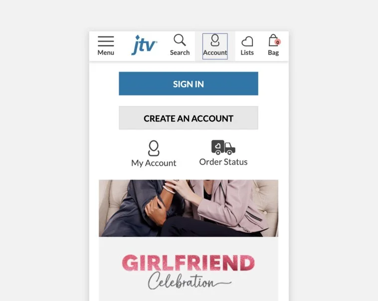
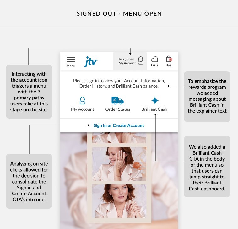
How do we emphasize Brilliant Cash in the header even when users are signed out?
Solution
We redesigned the account menu completely by adding messaging and visuals that instructs users to sign in to view their Brilliant Cash balance.
Brilliant Cash Dashboard
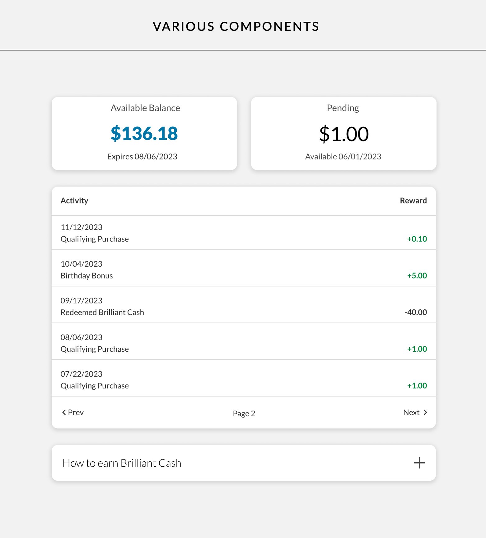
We created dashboard for users to see their Brilliant Cash balance and expiration date. The dashboard is a growing as new features are currently being scoped such as a ledger to view when Brilliant Cash was earned and redeemed.
